Update: Sorry, I apparently didn’t have the proper ‘before’ slide. I assure you, it was an honest mistake. The proper slide is now shown below.
***
In case you haven’t heard, Ubiquity, the standard Ubuntu installer, is getting a slideshow. That way you have something to look at while it’s busy installing packages on your system.
Well, thanks to my recent interest in Ubuntu Teams, as alluded to in my previous post, I decided to become involved, and joined-in the IRC chats at #ubuntu-doc. After some talks, back and forth with Dylan McCall, who is the project maintainer at the Launchpad page, I decided to give my own artistic skills a try, and came up with my own mockup of how the slides could look. So, here I present the ‘before and after’, and let you, the audience decide what they think of my improvements on the existing design.
Before:
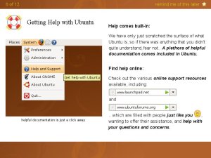
After:
I did a lot of changes, as you can see:
* Playing it safe, I chose a 800×600 canvas size.
* The top and bottom margins serve two purposes. They provide ambiance and enforce the brand identity, while also allowing us to more gracefully scale to smaller display dimensions.
* In the top margin, we have the page count, and the “remind me of this later” bookmark functionality. I’ve chosen to use the firefox bookmark star, for familiarity and consistency. In a similar fashion, the star can be hollow when de-selected.
* The smiley is from Pidgin (/usr/share/pixmaps/pidgin/emotes/default/smile.png)
* The bottom margin can be used to display the slideshow controls, or just simply left as is.
* I’ve used only a single ‘slide’ (which is only 16.6 KB), but it’s the most important one to display, as it shows the end-user exactly where to look for additional help. The slide will need to be “re-shot” in various languages, though. ‘Slides’ on other pages need not be of identical size, nor even have the same location on the page. On the left or right, slightly higher or slightly lower, it is good to vary the presentation, which makes the pages more memorable, less predictable, and therefore less boring. (Buy the way, can we possibly change the terminology here? Referring to the inline images as ‘slides’ is a bit confusing, when in fact, the entire ‘page’ is itself the slide in a slideshow. Maybe “snapshot” would be better?)
* I’ve made some subtle changes to the text, mainly to make it feel more personable – after all, isn’t Ubuntu all about making the experience of technology more personable? Maybe we can work with the translators, so that an equally welcoming and personable tone will be conveyed in all translations. I’ve also added headings and bolded certain phrases for easy visual scanning.
* I’ve placed the URLs within the Firefox-3 address bar (aka “Awesome Bar”) – which is precisely where the user will no doubt be placing them. I like the idea of presenting information within the same visual context as it will be used — this applies to the snapshot as well. In addition, presenting the URLs this way draws visual attention, and breaks up a block of otherwise just plain text. It would also be cool if we could make those images link to the URLs, such that a user could simply click on them to open up the webpage in a browser.
* From the wallpaper (which appears in the top and bottom margins, as well as the snapshot) you can see I’m running Hardy. I’m undecided if it should be changed to the Karmic wallpaper or not. I’m concerned that if we use the Karmic wallpaper, that would only make it stand-out less when displayed on the Karmic desktop. What do you think? Another option is, if we diliberately avoid matching the current (ie. Karmic) wallpaper, then I think we could instead have each page/slide be represented by a different wallpaper from a past Ubuntu release (eg. slide ‘1 of 12’ could use Gutsy, slide 2 could use Intrepid, etc.) This could heighten visual interest, and act as a kind of hommage to Ubuntu’s past. Plus, it communicates diversity, by showing the plethora of Ubuntu animals. The only complication this raises, is that the accent color (in this case, the yellow text) might have to change with each wallpaper as well.
* Overall, it’s a well-blananced composition, with some variety, and multiple points of interest, which keeps the eye moving and engaged. I dare say it’s quite handsome 🙂
So, what do you think? Obviously you can post your comments here, but if you want the slideshow developers to see them, I suggest you do the following. First, head over to Launchpad.net, and register for an account. Then, go to the project page and ‘subscribe’ to the Team. When you get approved they will send you an email. Then, you will be able to post to the mailing list, and you will be mailed copies of all the new posts to that list.
I look forward to hearing your feedback.
******************
New:
I’ve come up with a couple of alterate slides, with some subtle changes from what I’ve done above.


Thanks for this mockup 🙂
After seeing it (and a more direct side by side comparison) I will definitely be addressing the top margin. My title text is unnecessarily huge, it and the emblems are in conflict, and they waste way too much vertical space. Yours looks really good.
The filmstrip of screenshots will be staying somewhat as it is, but this does show that sometimes an exception to that convention is useful and visually appealing.
Pingback: My second mockup suggestion for ubiquity slideshow « Ubuntu WTF!